
Rediscovering My Smartphone: How Niagara Launcher Transformed My Daily Interaction
It was in 2026, staring at the same old grid of icons on my large-screen smartphone, that I realized my digital life had become a source of monotony and distraction. I had even experimented with highly utilitarian launchers in a bid to boost my productivity, but they only added to the visual noise. I craved something genuinely fresh, a clean slate that would make my phone feel new again. That’s when I discovered Niagara Launcher, a minimalist interface designed for modern, large-screen devices. It promised a simple, efficient, and distraction-free way to access everything on my phone, and I decided to give it a shot.
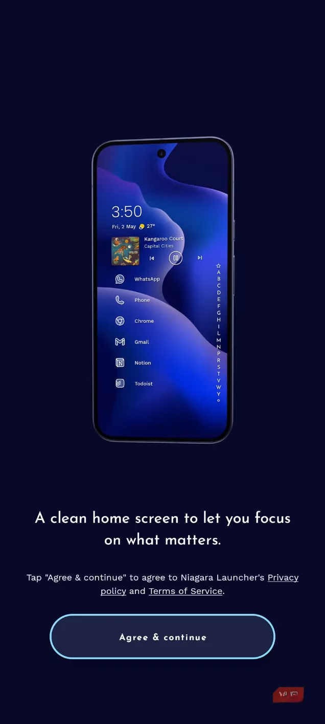
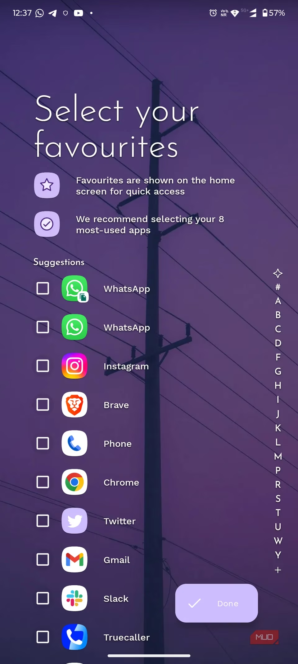
Setting it up was as refreshingly simple as the launcher itself. After downloading, I launched the app and granted the necessary permissions for notifications and accessibility to unlock its full potential. The first delightful step was choosing my favorite apps—up to eight of them—to live right on the main screen. I then scrolled to the bottom of the app drawer, entered the Niagara settings, and enabled the automatic music app appearance. A quick dive into the themes and appearance settings let me tweak the look to my liking. These steps, though minimal, felt intentional and personal.
This philosophy of minimal customization is the core of Niagara. Compared to other Android launchers that drown you in options, Niagara offers just enough. It achieves a perfect balance: a setup that’s distraction-free without being barren. It felt like a conscious design choice, not a limitation. The traditional Android home screen, with its sprawling grid of icons, was built for a different era of smaller phones. On my large device, it meant awkward stretches to reach corner icons, a daily physical reminder of an outdated design.
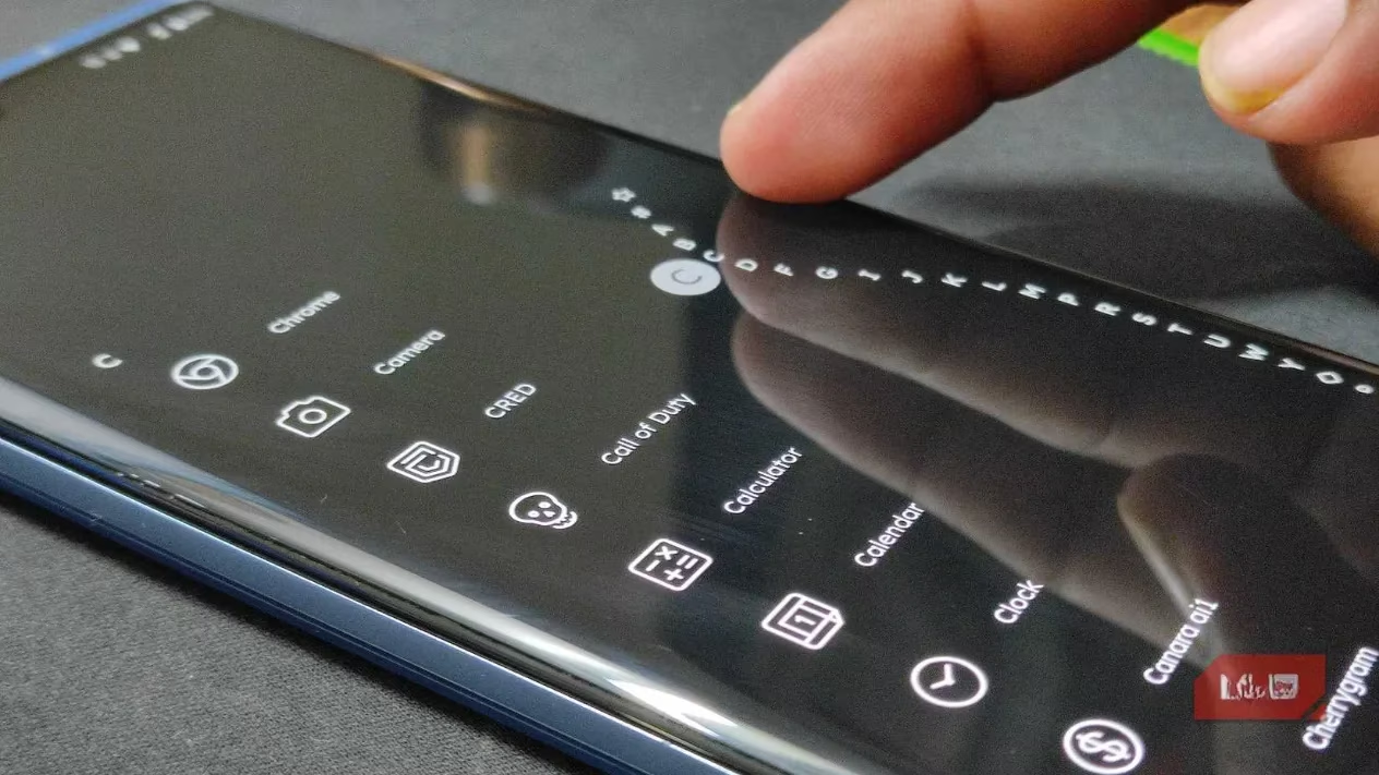
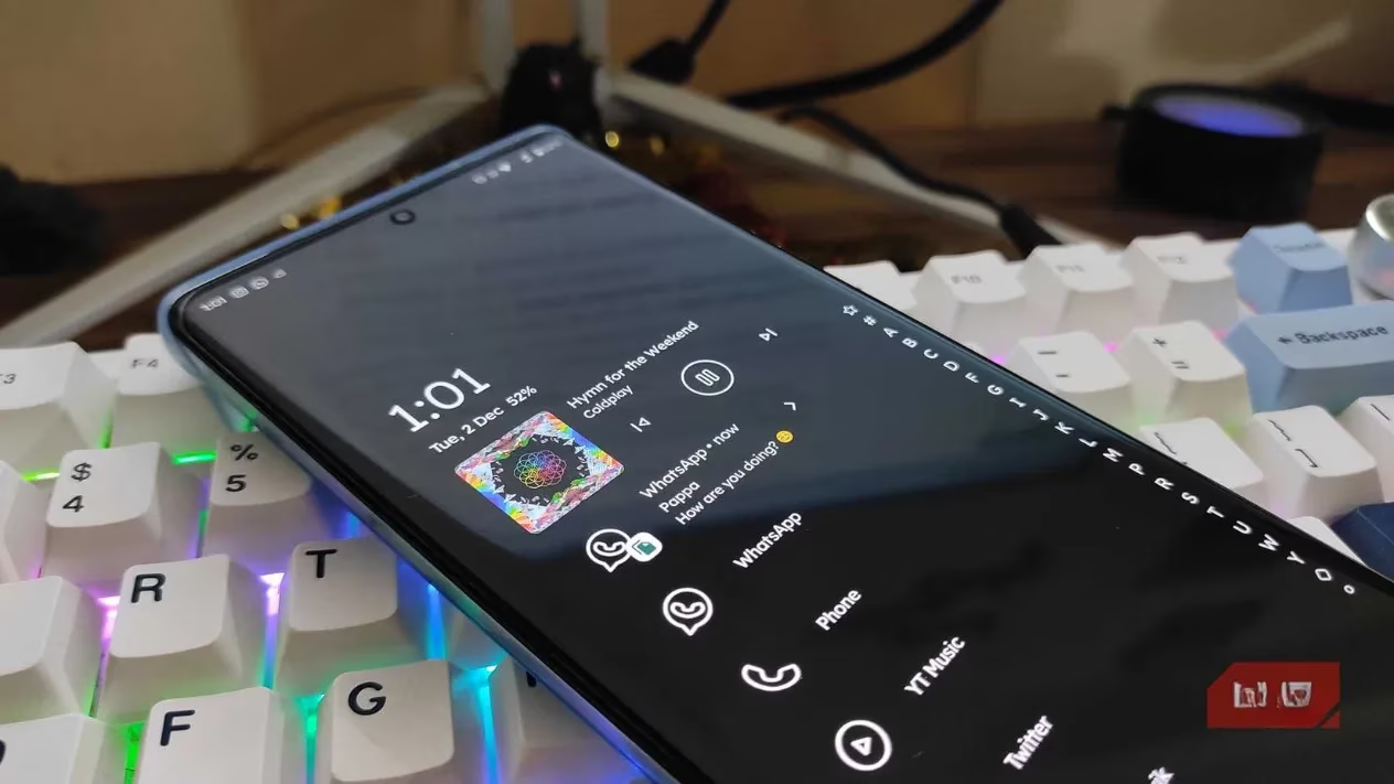
Niagara flips that script entirely. It presents a single, elegant, vertical list of all my apps, perfectly accessible with just my thumb. No more flipping through endless home screen pages. My essentials are right there, and the rest are a simple swipe away. The genius touch is the alphabetical wave scrollbar on the side. A quick tap on a letter instantly jumps me to that section of the list. Finding any app became a glide, not a search. This design is a revelation for navigating a growing app collection; it’s faster and puts far less strain on my hand.
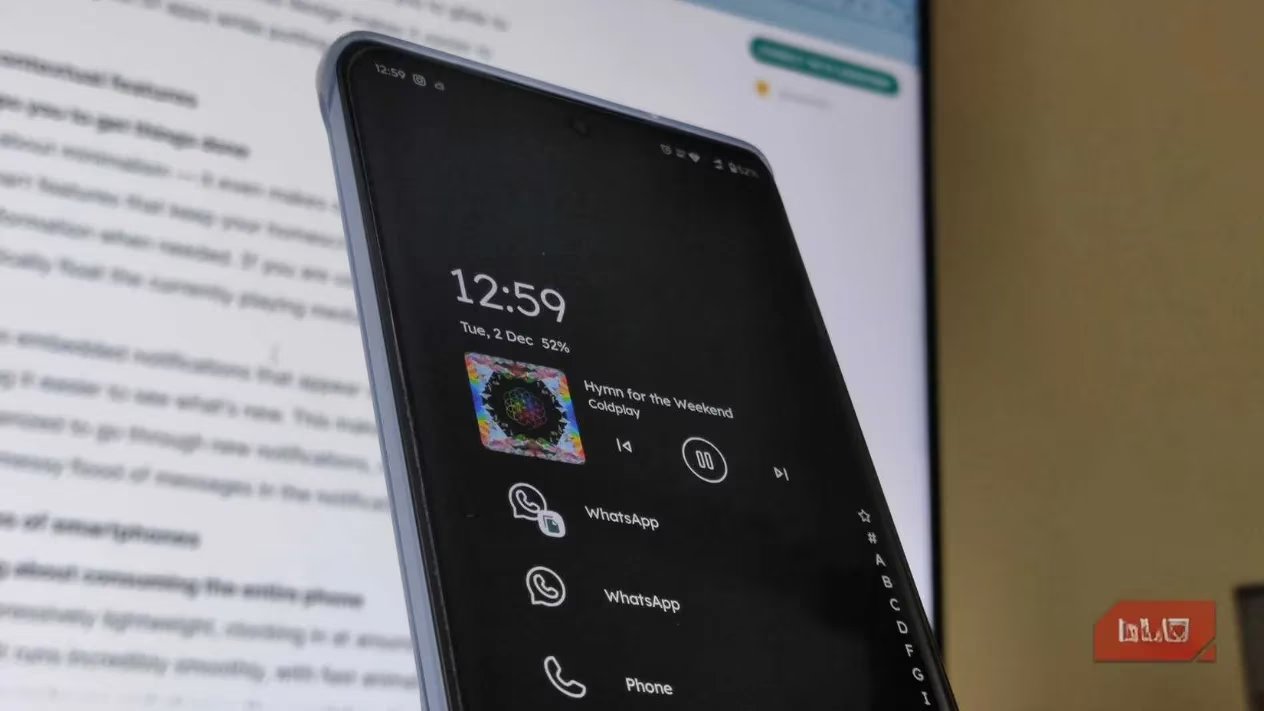
But Niagara is more than just a pretty, minimalist face. It’s smart where it counts. When I start playing music or a podcast, the media controls automatically float to the top of the home screen. It’s seamless and useful. Even better are the embedded notifications. New alerts appear cleanly within the app drawer list, giving me a clear, organized preview. I found this infinitely cleaner than the chaotic flood of the standard notification panel or the vague dot on an app icon. It made managing my digital attention feel calmer.
The technical performance is just as impressive. Niagara is incredibly lightweight, taking up only about 115MB of storage. This translates to buttery-smooth animations and a fluid interface, even on mid-range phones. There’s none of the lag or stuttering I’ve experienced with heavier, widget-packed launchers. It’s also fully modern, supporting Android 15 features like App Archiving and Private Space. I’ve grown to love the little convenience of double-tapping the alphabet scrollbar to turn off my screen—a small gesture that feels perfectly integrated.
The most profound impact, however, has been on my phone usage habits. By stripping away the visual clutter and focusing on essentials, Niagara has made my interactions more intentional. The minimalist design naturally discourages mindless app-hopping. The inline message previews and contextual app appearances (like the music player) mean I switch apps less frequently. Everything feels purpose-driven. The one-handed convenience has been a game-changer for ergonomics, eliminating those awkward finger gymnastics on my 6.9-inch screen.
Of course, there was an adjustment period. The absence of traditional home screen widgets and the familiar grid felt strange at first. But after a few days, that feeling vanished, replaced by a sense of efficiency and calm. Switching to Niagara Launcher was the refresh I didn’t know I needed. It solved my boredom with the standard layout by replacing it with an ergonomic, intelligent experience tailored for how we use large phones today. It’s not just aesthetic minimalism; it’s functional minimalism that makes my phone feel faster, smarter, and decidedly less distracting. It hasn’t solved every minor quirk of Android, but it has made using my phone interesting—and enjoyable—again.