
Why I Always Disable At a Glance on My New Android Phone
We all develop our own rituals when setting up a new phone. Over the years, I've formed a habit that's become non-negotiable for me. Whenever I unbox a new Android device, the very first thing I do is head straight to the settings to disable one particular feature. It's a step in my routine that I never skip, and it's all about reclaiming control over my home screen experience. This feature, Google's At a Glance widget, despite its ambitious promise, has consistently fallen short for me, leading to a decision I make without hesitation.
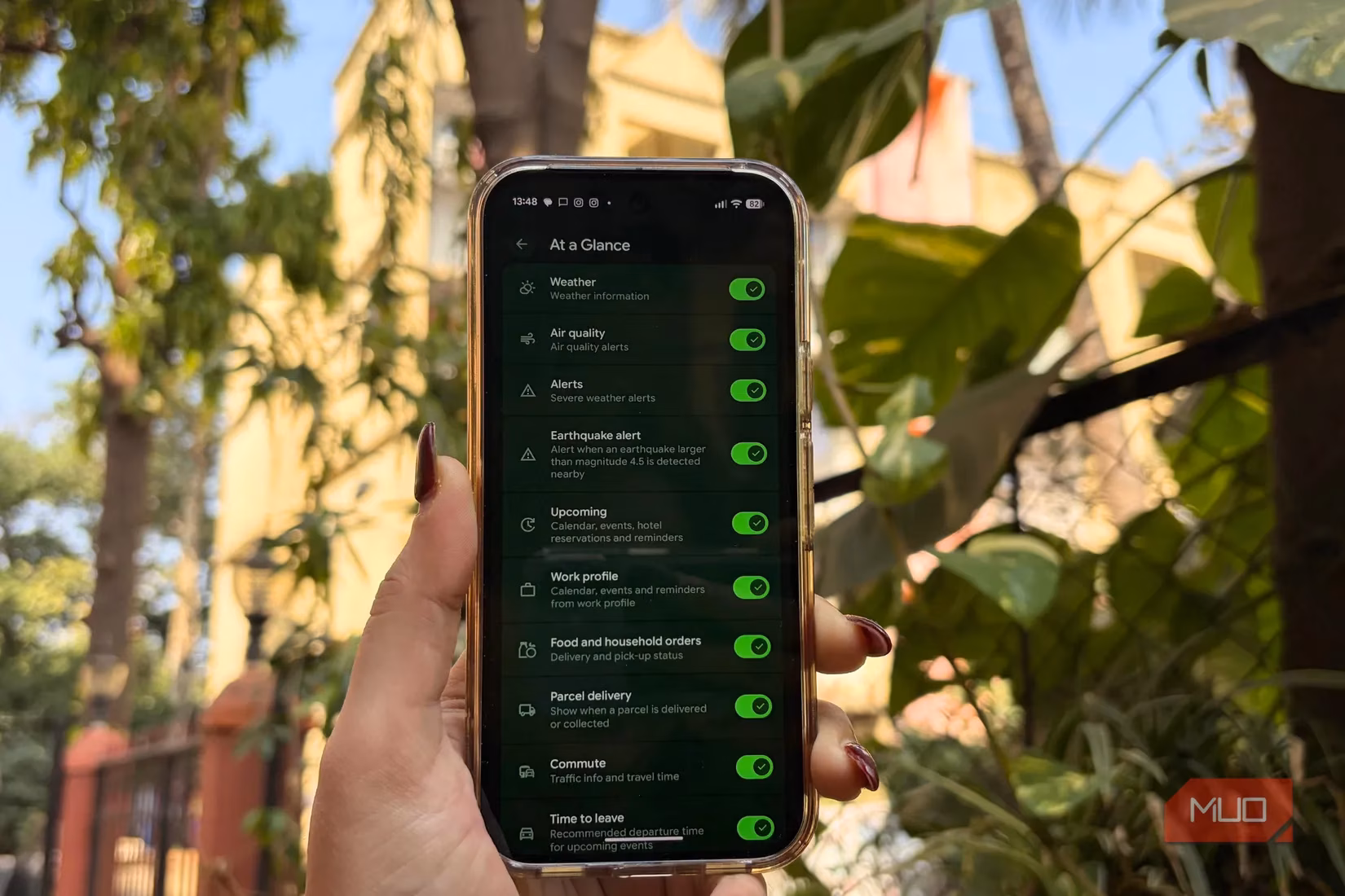
Let's talk about what At a Glance is supposed to do. Google introduced this feature nearly a decade ago on Pixel phones, and it's designed to be a central hub for your day. It sits prominently on both the home and lock screens, aiming to surface crucial information without you needing to open multiple apps. The vision is impressive—it's meant to aggregate a wide array of timely updates:
-
Weather & Alerts: Current conditions, air quality, and severe weather warnings.
-
Daily Logistics: Upcoming calendar events, commute updates, and "time to leave" reminders.
-
Personal Updates: Food delivery status, parcel tracking, and even bedtime routine prompts.
-
Quick Controls: Access to timers, the torch, and connected device statuses.
In theory, it sounds like the perfect dashboard. You can customize which bits of information appear, tailoring it to show only what's essential. It's marketed as a smart snapshot that keeps you informed at a glance. For someone who values efficiency, this should be a dream feature.
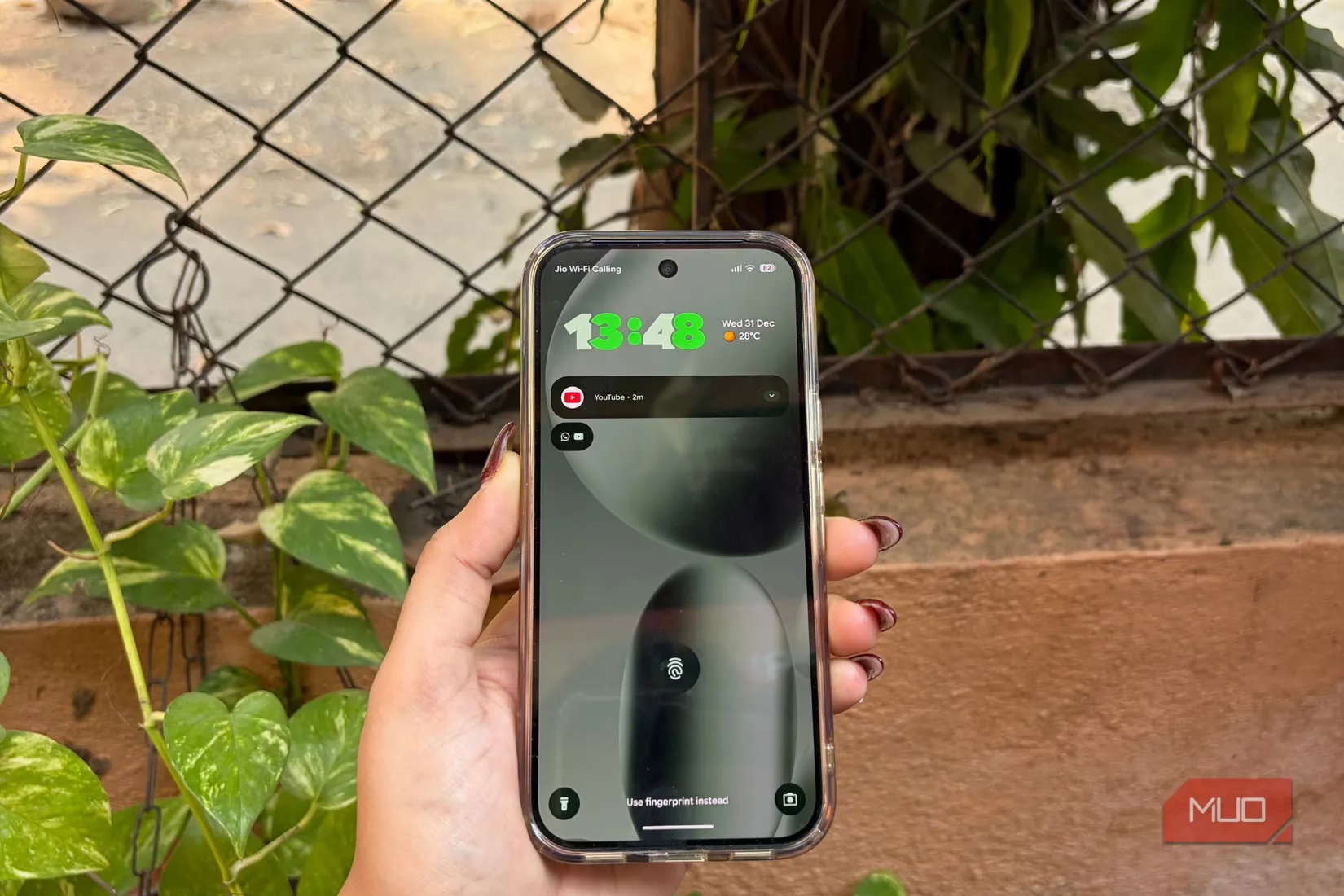
However, the reality of using At a Glance has been a different story for me. My first gripe is with its footprint. The widget occupies a significant chunk of prime real estate on my home screen. On modern phones with smaller screens, this isn't just a minor inconvenience—it actively makes the layout feel cramped and pushes my most-used app icons out of their ideal spots. I'm someone who likes a clean, organized, and aesthetically pleasing home screen, and this widget often disrupts that balance from the get-go.
But the space issue is just the beginning. The core problem is the widget's profound and persistent inconsistency. 😕 Even after meticulously enabling every possible toggle and granting all necessary permissions, its behavior remains utterly unpredictable. Some days, it might correctly show the weather. On most days, however, it fails to display the very information it's supposed to highlight. As I write this in 2026, reflecting on my experience with recent models like the Pixel 10 Pro, the issue persists. It raises a fundamental question: what is the value of a feature that works only sporadically?
I've encountered numerous bugs that degrade the experience further:
-
Showing temperature in the wrong units (Fahrenheit instead of Celsius) after a routine software update.
-
Text and information overlapping with my app icons, creating a messy, unfinished look.
-
Complete failure to surface critical information, like travel details, even when everything is correctly configured in my Google account.
I want to be clear—I didn't give up on it easily. I'm an enthusiast who loves to explore and utilize features that genuinely save time. I gave At a Glance more than a fair chance. When problems arose, I assumed they were temporary glitches. I restarted my phone, cleared caches, and patiently waited through multiple Android updates, hoping the next one would bring the polish this feature desperately needed.
The most telling example happened recently. I had a flight in two days. I had completed online check-in, all my travel details were synced to my Google account, and the travel toggle in At a Glance settings was firmly switched on. Yet, my home screen remained stubbornly blank regarding my trip. The widget failed at the exact moment its core purpose was to be helpful. This pattern of unreliability became the defining characteristic of my experience.
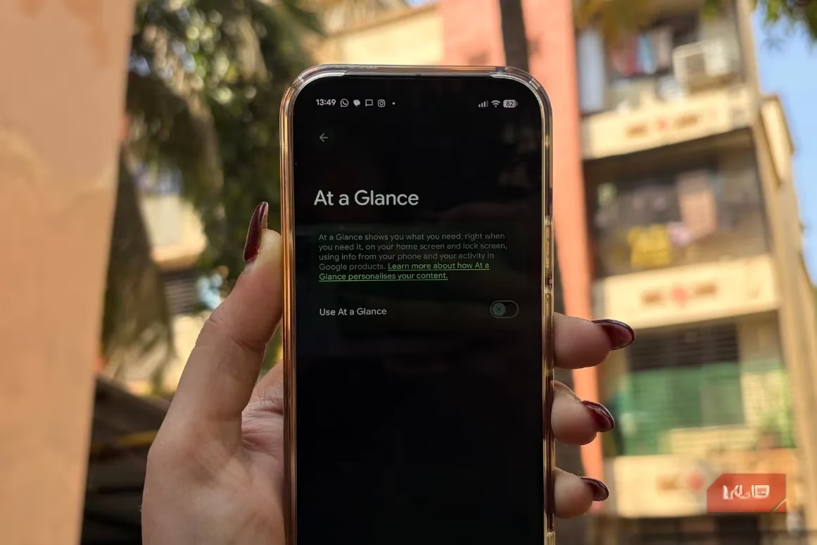
For the longest time, Google didn't even provide an option to remove At a Glance. Users like me, who found it more annoying than helpful, were stuck with it permanently glued to the screen. Thankfully, that changed. Now, disabling it is a simple, three-step process that feels like a breath of fresh air:
-
Long-press the At a Glance widget on your home screen.
-
Tap 'Settings' from the menu that appears.
-
Toggle off 'Use At a Glance'.
And just like that, it's gone from both your home and lock screens. The sense of relief is immediate. I performed this ritual on my Pixel 9 and again on my Pixel 10 Pro without a second thought.
I understand that software features can have rough edges, especially at launch. I'm willing to be patient. But when a feature remains buggy and inconsistent across years and multiple major device generations, it stops being a work-in-progress and starts being a nuisance. The persistent lack of reliability is the sole reason it's the first thing I disable.
This isn't to say I'm writing off the concept forever. If Google ever manages to overhaul At a Glance, making it genuinely reliable, fast, and less intrusive, I would happily reconsider. The promise is still compelling. But until that day comes, I've found peace and greater utility in alternatives. My home screen is now freed up for widgets that perform specific functions consistently—a dedicated weather widget, a clean calendar agenda, and a minimalist clock. They might not have the unified "smart" branding, but they work every single time I look at my phone.
In the end, personalizing your phone is about creating an experience that works for you. For me, that means prioritizing reliability and control over a feature that promises everything but delivers inconsistency. Disabling At a Glance isn't just a setting change; it's a deliberate choice for a smoother, more predictable daily interaction with my device.